E-commerce site and purchase app optimization
Esurance.com allows customers to get insurance quotes and purchase or access their policy online. It provides detailed information about products and policyholder apps as well as advice relevant to customers’ interactions with insurance.
Customer insight/Opportunity
Consumers find insurance confusing and expensive. To address their pain points the Esurance.com website has to be transparent, simple and approachable.
Objective
Boost quote initiation/completion and customer retention, by building trust and setting expectations for a seamless experience. Enhance product presentation and simplify user journey. Ensure consistent interaction patterns and visual continuity by implementing a branded design system.
My role
Led Visual, UX and architecture design and ongoing optimization.
Contributed hands-on to key design milestones and developed and documented the foundation of the brand and design system.
Led a team of 4 designers, collaborated across teams, and managed executive stakeholder relationships.
Increased quote initiation by redesigning product presentation
I created 3 distinct website design directions and tested the prototypes against the control version. Each represented a new style of product presentation, colors, font, imagery and messaging: the warm/friendly, the modern/clean, and the bold/charismatic.


We conducted a qualitative user research that revealed that all three new designs outperformed the control, with the modern, clean design emerging as the clear winner. The elements that worked for the user were pastel color palette, increased use of iconography and straightforward, benefit-focused headlines.
Perception based on likeability
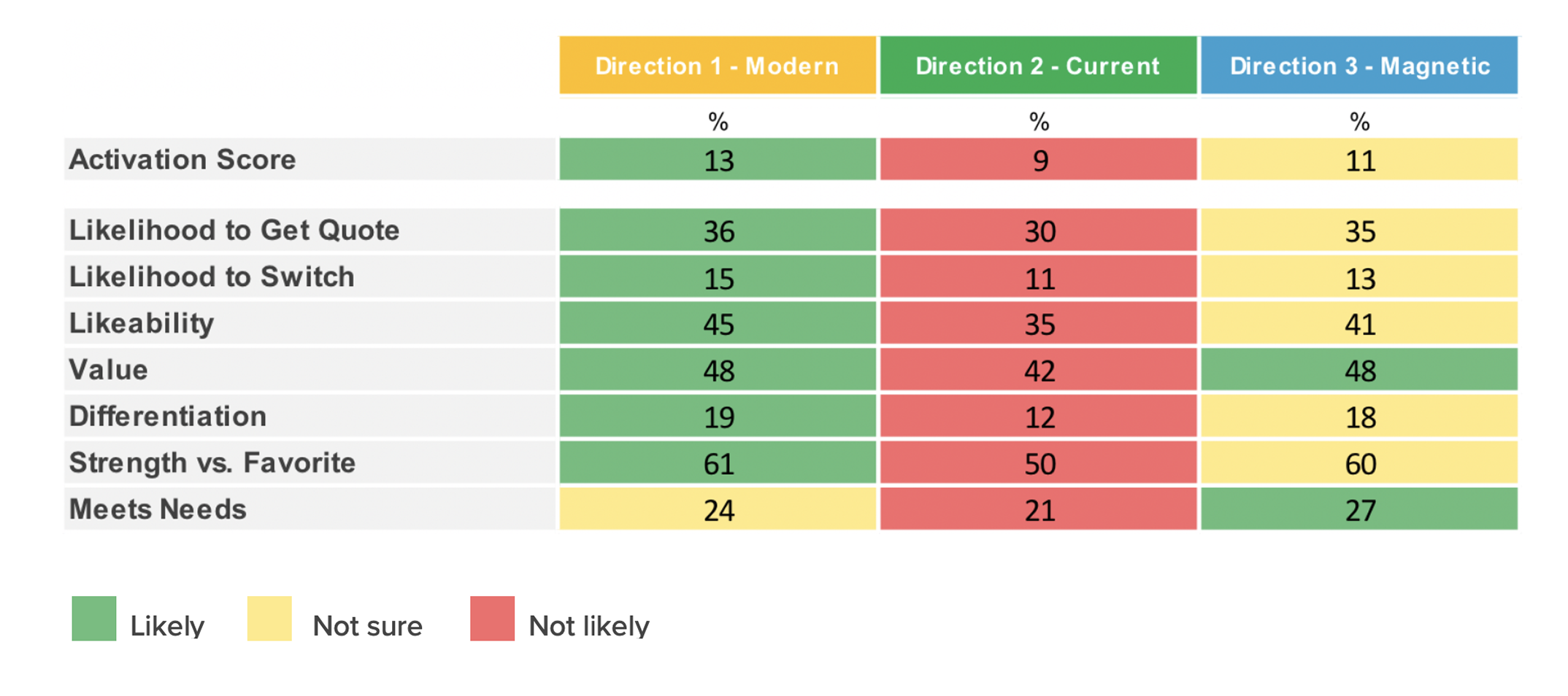
With user preferences in mind, we redesigned the ecommerce pages with updated UI elements, a refined color palette, iconography, and font hierarchy, making the interface and interactions clearer and more intuitive.
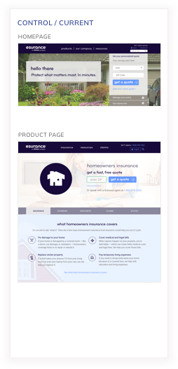
Before
Old homeowners insurance product page
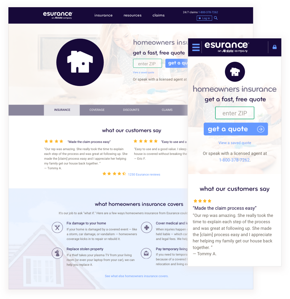

After
Redesigned homeowners insurance product page


Redesigned mobile app page


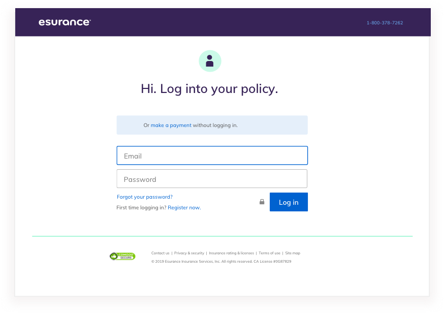
Redesigned login pages

Redesigned purchase app rating page.

Results and ongoing optimization
The redesigned Esurance home and product pages increased the CTR by about 3 percent monthly.
We continued A/B and multivariate testing to optimize the performance. Below is an example of a home page multivariate test involving copy and imagery iterations.


Brand and design system foundations
After redefining the visual brand I documented it in a sharable style guidelines resource. Based on the evolving product design needs we built a design system that ensured visual and functional consistency across products.


Adoption and results
The consistent implementation of the new brand guidelines and the new design system in Esurance.com, the purchase app, the claims app and digital campaigns, had a positive impact on marketing and product KPIs, especially the unaided awareness (+4%), and quote completion rate (+3).