Esurance Website
Esurance.com gives customers an opportunity to get an insurance quote and to purchase or access their policy online. It provides detailed information about products and policyholder apps as well as advice relevant to customers’ interactions with insurance.
Customer insight/Opportunity
Consumers find insurance confusing and expensive. To address customers’ pain points the Esurance.com website has to be extroverted, simple and approachable.
Objective
Increase quote initiation rate and customer retention by simplifying the look, UX, architecture and voice. Support the bold, self-confident and savvy brand perception. Set up users’ expectations for an easy and straightforward experience.
My role
Led Visual, UX and architecture design and ongoing optimization.
Contributed hands-on work at high-level design milestones, page layouts and UI style guides.
Managed a team of 4 designers.
Coordinated cross-team collaboration to assure consistency of the customer journey.
The process
We shaped the overall design direction by testing 3 product page prototypes against the control version. Each represented a distinct design style, colors, font, imagery and messaging and was focused on a different aspect of brand personality: the warm/friendly, the modern/clean, and the bold/charismatic.


All 3 new designs outscored the control version with the modern and clean winning in a qualitative concept test. The elements that worked for the user were pastel color palette, increased use of iconography and straightforward, benefit-focused headlines. Since we had no clear read on the photography style we conducted additional A/B testing and identified the version that got the highest CTR.
With the users’ preferences in mind we defined UI elements, a color palette, iconography and a font hierarchy and created a library of patterns and templates.
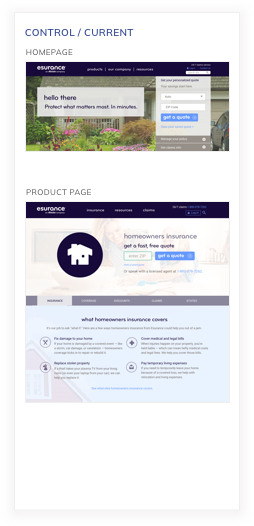
Before
Old homeowners insurance product page
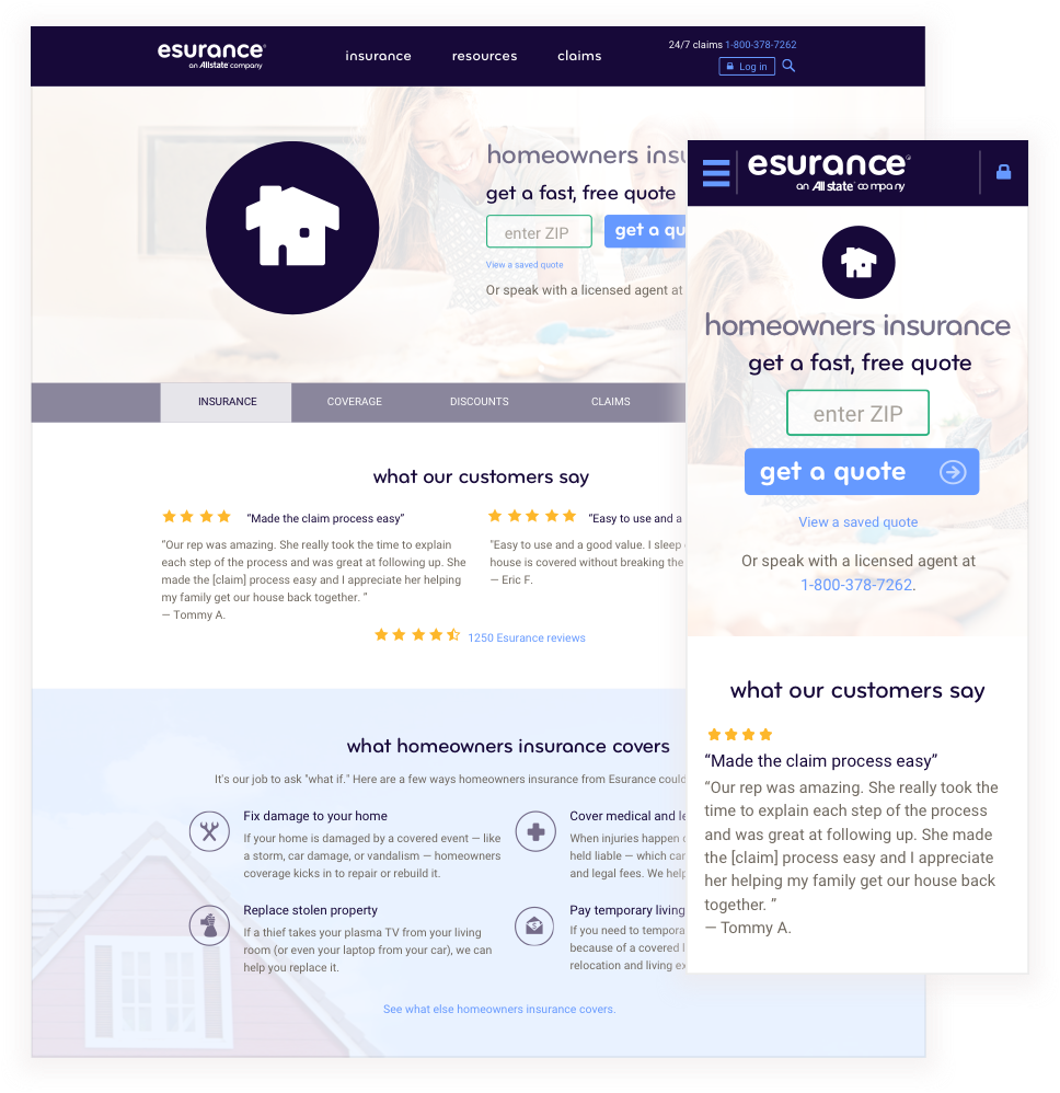

After
Redesigned homeowners insurance product page


Redesigned mobile app page


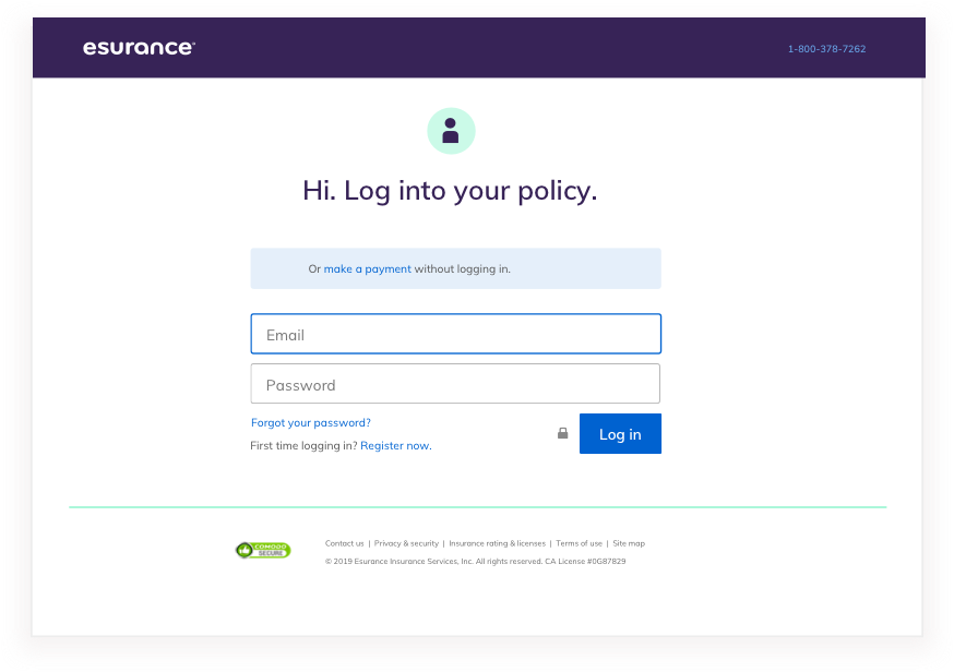
Redesigned login pages

Documentation

Results and ongoing optimization
The redesigned Esurance home and product pages increased the CTR by several percent. Users found the interface and interactions to be clearer and more intuitive. We continued A/B and multivariate testing to optimize the performance. Below is an example of a home page multivariate test involving copy and imagery iterations.


