Autodesk Profile
Customers are expecting from Autodesk more than great software. Profile is an opportunity to build a personalized relationship with the consumer by providing an experience than is relevant to the individual so that they can get more value from using the product. To accomplish it we redesigned the portal to be more customizable, transparent and easy to use.
Problem
As a user I can’t see my profile settings at a glance. My information is difficult to find and update. I see no value in completing my profile. I can’t use it when I’m away from my desk.
As a business we want to maximize the opportunity for data collection so we can target our communications better.
Goals
Create intuitive interactions that facilitate trust. Modernize it to be responsive to users’ lifestyle and viewing devices. Show the benefits of profile participation and completeness. Understand user needs and behaviors to personalize communications, and target product use and retention.
My role
Involved from concept to execution in the UX and Visual Design role.
Delivered prototypes and iterations, participated in user validation and design reviews and iterated to address feedback. Handed off high-fidelity mockups to engineering.
Brainstormed design and technical challenges at standups and demos and proposed solutions.
Conducted QA, identified defects and logged in Jira tickets.
Collaborators: Product Manager, Engineering, UX, Design System team
Process
We focused the redesign on 3 personas, each of them a professional with a dynamic career. They need an interface that’s quick and easy to manage. They also want to be sure why it’s worth for them to engage.

User feedback:

“It’s hard to see my information at a glace. I can’t see it when I’m away from my desk.”
Solution:
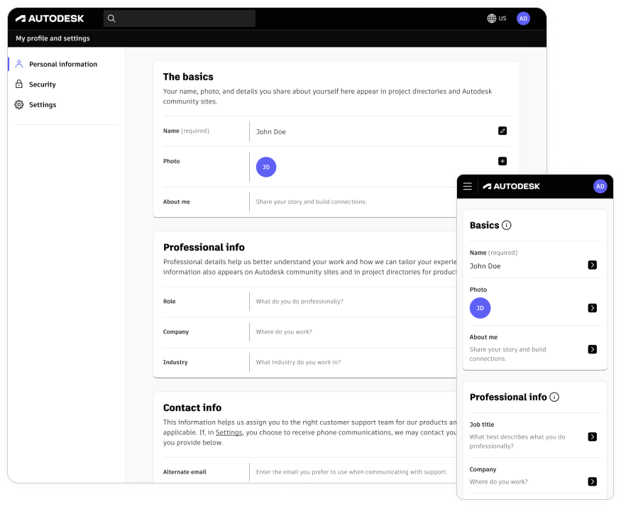
Following benchmarking research, we reorganized the information architecture dividing content into more logical sections. We created a clear navigation and renamed the nav items according to web standards.
On the dashboard we used a set of action cards customized per personas and their interests. The new layout created a better overview of their profile and a direct path to edit.
We made the portal responsive to ensure access on the go.
We aligned it with Autodesk Design System for a continuity of customer experience and increased trust.
Old and new: Profile Dashboard


User feedback:

“My information is difficult to update. I see no value in completing my profile.”
Benchmarking and user research:
We researched what layout and interactions other companies apply to let users view and edit their profile data. We considered allowing edit in a modal, on a new page or a side drawer. We validated our ideas with users and following their preference we proceeded with a panel list for user data display and a drawer pattern for editing.
Solution:
We utilized modular layout and the editing-in-place feature to simplify managing personal information.
We collaborated closely with copy strategy team in regular design sessions to provide a rationale behind asking users for their personal details. We placed an explanation of how we’ll use their input in a paragraph under each section heading.
Old and new: Personal Info page — 0 state

Redesigned interactions: editing personal information


Old and new: Security section
We maintained layout consistency in the remaining sections.


In cases of complex mutli-step editing, such as 2FA setup, we took the user trough a series of screens.

Business feedback:

“We want to maximize the opportunity for data collection.”
Solution:
Utilize interface components that allow for more precise capturing of user data. Use a combobox component instead of text input to make users chose from preset conventions rather that allowing them for unmoderated input.
Old and new component: Industry field

Results
Since the release we got 800k users engaged in the Personal Info section, 300k in Security and 255k in Settings.
Next steps – ongoing optimization
During user testing shortly after the release we learned that customers:

Appreciated the drawer feature
Valued the minimal and organized look and feel
Pleased with the experience overall, little to critique
But also they’d like to see further improvements:

