Autodesk Design System (DHIG)
Autodesk Design System called DHIG (Digital Human Interface Guidelines) is a coherent, branded language for the product that combines the values of usability and esthetics and forms the base of the digital ecosystem. It ensures a seamless end-to-end customer experiences across the entire journey. Internally, it is an essential, time efficient and easy to use set of tools and processes for designers and developers.
Problem
Autodesk portals had inconsistent design. Web and mobile transactional and subscriber interactions required components, patterns, and styles that the design system didn’t cover. Teams worked in siloes and created their own versions which resulted in discrepancies in aesthetics, grid, and functionality. Usability was compromised as customers were confused by different implementation of the same tasks.
Solution
Create a unified system of reusable, scalable and responsive components and patterns in Figma design libraries and in code. Eliminate UX and engineering repetitive work and allow for focus on unique aspects of a project instead. Improve user experience by minimizing learning curve.
My role
I was part of the team that created and implemented the new design system.
Provided existing use cases to be considered in component creation as well as feedback about how well new components satisfied UI requirements.
Contributed to a library of components and patterns.
Led the implementation of the system into the Account, Profile and Identity platforms delivering visual mockups and proposing enhanced functionality enabled by new components.
Reviewed the work of other designers and facilitated a dialog between the system engineering and consuming teams when new variants or customization was needed. Conducted QA and classified defects into blockers or backlog items.
Process
Branded foundational elements
We started by defining foundational elements following the new redesigned Autodesk brand. This included responsive typography based on a mathematical scale, global color primitives, spacing, and elevation. We communicated the guidelines to design and engineering using tokens (variables).


We made text, color, and effect styles available to designers and engineers in a Figma library.


Components
Keeping the foundational elements in mind we created basic building blocks to be applied across interfaces. To make them truly scalable we involved UX owners of all digital properties to conduct audits of existing use cases. At the same time hand we referred to MUI for form and functionality web standards. Component iterations went through design and engineering team reviews as well as accessibility and user testing. Eventually they were included in the Figma UI Toolkit complete with variants and states, availability in code information, and recommendations of how and when they should be used.
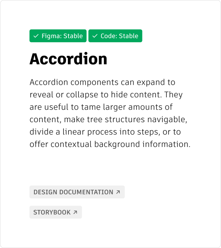

Those accordion variants have been made available in Figma UI Toolkit library.


Implementation in post-purchase user interfaces improved functionality and consistency
As the core group of components became ready in code, I led the process of converting Autodesk experiences to the new brand and design system standards. I focused on the Account, Sign in and Profile experience creating high-fidelity mockups myself, and providing consultation to UX designers. I was pleased to see that the components not only improved the consistency and elegance of the interface but also the functionality and interactions.
Implementation examples
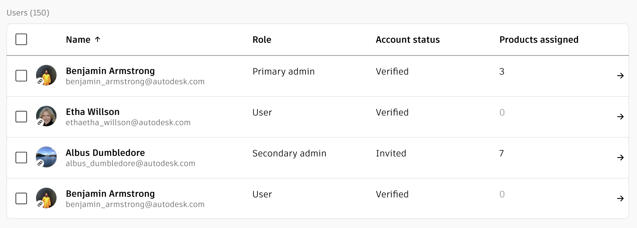
The redesigned panel list component I used in the Move Subscription flow had a crisp, more accessible look and also offered a bulk selection option which made the interaction of choosing products more clear for the administrators.
1 – Move Subscription Flow
Old design

Redesigned experience incorporating new components

2 – SSO Setup
I reused the Stepper component in SSO setup design ensuring experience continuity and saving design and engineering time.

3 – User and Subscription Management
The same panel list component accommodated for both user and subscription management listing.

Creating patterns and templates
Collaborating with UX teams we identified cases where sets of components were reused and documented them as reusable patterns. One of them was a filter bar with a customizable set of filtering options. It can be placed above a list to let the user define the scope or the organization of the list content.


At the same time we saw pages that had similar role in a task flow and created templates to streamline the experience. Below is a full page error template and an example of implementation.


Results
The Design System is used by 95 teams. It reduces repetitive effort and empowers our internal partners to be full stack UX designers and engineers. It supports customer success and upholds the value of one Autodesk.